For documentation on the current version, please check Knowledge Base.
Dataset Legend : Pie Charts
It is a circular chart divided into sectors, illustrating the the attribute values.
Labels and Pie Charts are the Legend Layout Component
![]() Legend Editor > Classification
Legend Editor > Classification
Pie Chart Setup

Activate pie charts and choose the way which they are defined.
By Attribute
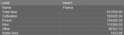
In Orbit GIS, an object can hold several records or attributes per Attributeset. Each slice of the pie chart is defined by the (first) value of an attribute.
Use this charting technique to graphically represent the value attribute according to the other chosen attribute values per object. |
By Classification
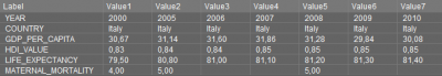
In Orbit GIS, an object can hold several records or attributes per Attributeset. Each record of an attribute set of an object can have one or more values. This means that one attribute record can have several values.
Use this charting technique to graphically represent the different values of one attribute per object.
Note: this option is not available for attributes of a shapefile, because shapefiles cannot contain more than one value. (Except when an external table with more values is linked to a shapefile, more information see Joins)
Pie Chart Appearance
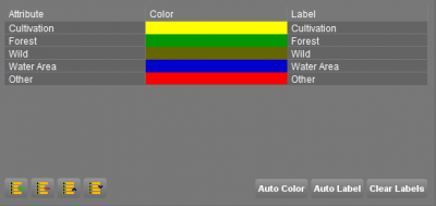
Slice Definition
Define slice parameters.
| Object Inspector | |
 |  |
| Slice Definition | |
 |  |
Labels
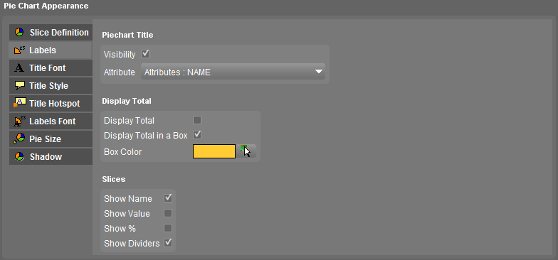
- Piechart Title
Visibility - Tick to show a pie chart title
Attribute - Select the attribute which value will be used as pie chart title
- Display Total
Display Total - Tick to show the total value of the pie chart, the sum of the values of the different pie chart slices
Display Total in a Box - Tick to show the pie chart total in a box
Box Color - Choose a fill color using the color picker for the pie chart total box. This option is only useful when totals are displayed in a box.
For Pie Chart definition by attribute the sum of the attribute values will appear. For Pie Chart definition by classes the row count (amount of records) will appear.
- Slice Labels
Show Name - Tick to show the names of the pie chart slices
When attribute usernames are applied, see Dataset Structure - Naming, those usernames will appear as labels for pie charts when Show Name is applied.
Show Value - Tick to show the values of the pie chart slices
It is possible to give labels to attribute values, see Valuelist . When the Show Value is applied, the attribute value labels will appear.
Show % - Tick to show the percentage of the slices value to the total pie chart value
Show Dividers - Tick to show the dividers between the pie chart slices
Examples of using the Pie Chart label parameters see : Title / Labels


Title Font
See Label Font.
Title Hotspot
See Label Hotspot.
Labels Font
See Label Font.
Pie Size
The size can be determined by an attribute value:
- choose the attribute that must determine the actual size,
- define a minimal and maximal size of the pie chart in pixels on screen,
- the pie chart size will be interpolated according to the attribute value.
Note: It is also possible to use meta-attributes such as row count (amount of records) for this attribute.
Shadow
See Shadow
Examples and Steps to create
- Turn on Pie Charts : tick “Show the pie charts”
- Select Pie Chart definition : By Attribute or By Classification
- If By Attribute
- Attribute: Select an attribute for the slice using the drop-down box. Invalid attributes of data type string or boolean aren't selectable
- Color: Choose a fill color from the color picker window for the slice or use Auto Color
- Label: Enter a label name for the slice or use auto label
- If By Classification
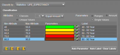
- Classify by: Select an attribute which values will be represented in a pie chart
- Classification box: See classification in classes