This is documentation of an archived release.
For documentation on the current version, please check Knowledge Base.
For documentation on the current version, please check Knowledge Base.
Map Print Layout
The Print Layout is the combination of the MapView and additional print graphics and tools to Print your map.
A Print Layout can be saved as Print Template for future use.
Print templates defines and contains :
- A map section
- Other graphics like a scalebar, north arrow, legend, …
- The page setup, format (A4, A3, …) and orientation (portrait and landscape)
Map View vs Layout View
| Map View | Layout View |
|---|---|
| Default workspace view for all GIS operations like viewing, selecting and editing of datasets. 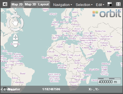 | Must only be used to prepare and to make your map Print. 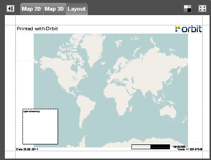 |
Print Layout Sidebar
 Map > Layout > Tools
File
Open, create new or save a print layout. Set the Print Layout Page Setup.
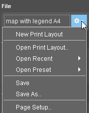
| Display Box | The name of the current used Print Layout is displayed in the box. Note: If no Print Layout is selected the box is empty and the Default Print Layout will appear in the Layout View. |
|---|---|
| New Print Layout | Create a new Print Layout. Orbit will automatically open the Default Print Layout to start from. |
| Open Print Layout | Open an existing Print Layout. |
| Open Recent | Open a recently used Print Layout. |
| Open Preset | Open a Print Layout that is stored in the default template map of Orbit. The default template map is: ../orbit/templates. Orbit will automatically recognize these templates at start up. |
| Save | Save the changes to the current Print Layout. |
| Save as… | Save the changes to a new Print Layout. |
| Page Setup… | Define the Page Setup Settings for printing for the current Print Layout. |
Add Component
Add a print layout component by clicking the component icon. The selected component can be From top-down, left-right :
 | Add Text | 1. Clik with the cursor on the Print Layout at the location of the text. 2. Enter the text. 3. Click ENTER. |
 | Add a Line | Add horizontal or vertical lines or a box. 1. Click with the cursor on the print layout to start editing the line. 2. Click to add perpendicular lines. 3. Finish by using the right-mouse option, select : Finish Annotation. |
 | Add an Image | 1. Select the image from the computer. 2. Drag to the right position. |
 | Add a Runtime object | 1. Drag the runtime object to the right position. 2. Edit the runtime properties |
 | Add a North Arrow | 1. Drag the north arrow to the right position. |
 | Add a Bar Scale | 1. Drag the bar scale to the right position. |
 | Add Legend Display | 1. Drag the legend box to the right position. |
| Add Map Component | 1. Drag the map box to the right position. |
Tools
Manage your print layout components.
 | Copy the layout object |
 | Past the graphic properties from the current layout object to new objects: 1. select the current object 2. Click the button in the Tools 3. Select the new object(s) |
 | Delete the layout object |
 | Replace/rescale the layout object |
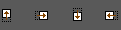 | Move the layout object upwards, to the right, downwards or to the left |
Appearance
Show print Margins. Zoom to Print Layout.
 | Show or hide print margins |
 | Zoom to full extent Print Layout |
Properties
Each component type has it's own properties. Change the presentation of the selected Layout component in the properties window.
Properties Text
 | Choose a font for the text. |
 | Enter the font size. |
 | Choose the color of the text. Use the color-picker window |
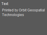 | Enter the text that is displayed in the Print Layout. Add a Runtime Object by placing it in curly brackets. This will generate an added text value, depending on the type of chosen Runtime Object. Scale {Scale} will display in the layout ex. Scale 1/100 Date {Date} will display in the layout ex. Date 18.10.2015 |
 | Lock Component: the component is unable to move. |
 | Fill Background: the background is filled with a white color, it improves the readability of the text. If the box is unchecked the background is transparent. |
 | Draw Border: The border of the textbox is displayed. |
Properties Line
 | Enter the line width. |
| | Choose the color of the line. Use the color-picker window. |
| | Lock Component: the component is unable to move. |
| | Fill Background: the background is filled with a white color, it improves the visibility of the line. If the box is unchecked the background is transparent. |
| | Draw Border: The border of the line component is displayed. |
Properties Image
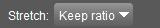 | -  Fit: the image is resized and rescaled to the box. Fit: the image is resized and rescaled to the box. -  Keep ratio: the image is resized to the box, the aspect is kept. Keep ratio: the image is resized to the box, the aspect is kept. -  No resize: the original size of the image is displayed. No resize: the original size of the image is displayed. |
 | Open the windows explorer and choose an image. |
| | Lock Component: the component is unable to move. |
| | Fill Background: the background is filled with a white color, it improves the visibility of the image. If the box is unchecked the background is transparent. |
| | Draw Border: The border of the image component is displayed. |
Properties Runtime Object
 | Choose the type. Each type will result in another text that is displayed in the Print Layout. The text is automatically generated. - Scale: the scale of the map in the Print Layout: ex 1/150000 - Date : the date when printed: ex. 14.02.2012 - Object Properties: - Information1: - Information2: - Information3: |
| | Choose a font for the text. |
| | Enter the font size. |
| | Choose the color of the text. Use the color-picker window |
| | Lock Component: the component is unable to move. |
| | Fill Background: the background is filled with a white color, it improves the readability of the text. If the box is unchecked the background is transparent. |
| | Draw Border: The border of the textbox is displayed. |
Properties North Arrow
| | - Fit: the image is resized and rescaled to the box. - Keep ratio: the image is resized to the box, the aspect is kept. - No resize: the original size of the image is displayed. |
| | Open the windows explorer and choose an image for the north arrow. |
| | Lock Component: the component is unable to move. |
| | Fill Background: the background is filled with a white color, it improves the visibility of the image. If the box is unchecked the background is transparent. |
| | Draw Border: The border of the image component is displayed. |
Properties Bar Scale
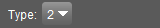 | Choose a bar scale type: - Type 0 :  - Type 1 :  - Type 2 :  - Type 3 :  - Type 4 :  - Type 5 :  - Type 6 :  - Type 7 :  |
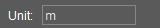 | Enter a unit that is displayed in the Print Layout that represents the unit of the scale in the bar scale. |
| | Lock Component: the component is unable to move. |
| | Fill Background: the background is filled with a white color, it improves the visibility of the image. If the box is unchecked the background is transparent. |
| | Draw Border: The border of the image component is displayed. |
Properties Legend Display
| | Lock Component: the component is unable to move. |
| | Fill Background: the background is filled with a white color, it improves the visibility of the legend image. If the box is unchecked the background is transparent. |
| | Draw Border: The border of the legend component is displayed. |
Properties Map Position
 | Adjust the position of the datasets: Zoom in or out or pan in the map component. Click STOP to end the function. |
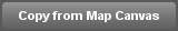 | After adjusting the position of the datasets, use this function to go back to the position of the map displayed in the Map View. |
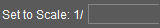 | Adjust the scale of the printed map to a specific scale. Enter the scale. |
| | Lock Component: the component is unable to move. |
| | Fill Background: the background is filled with a white color. If the box is unchecked the background is transparent. |
| | Draw Border: The border of the map component is displayed. |
Last modified:: 2019/03/25 11:36