Map Print Layout
The Print Layout is the combination of the MapView and additional print graphics and tools to Print your map.
A Print Layout can be saved as Print Template for future use.
Print templates defines and contains :
- A map section
- Other graphics like a scalebar, north arrow, legend, …
- The page setup, format (A4, A3, …) and orientation (portrait and landscape)
Map View vs Layout View
| Map View | Layout View |
|---|---|
| Default workspace view for all GIS operations like viewing, selecting and editing of datasets. 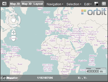 | Must only be used to prepare and to make your map Print. 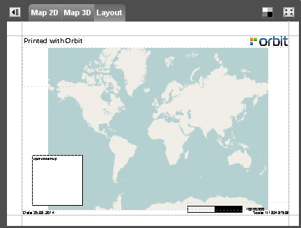 |
Print Layout Sidebar
 Map > Layout > Tools
File
Open, create new or save a print layout. Set the Print Layout Page Setup.
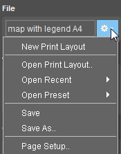
| Display Box | The name of the current used Print Layout is displayed in the box. Note: If no Print Layout is selected the box is empty and the Default Print Layout will appear in the Layout View. |
|---|---|
| New Print Layout | Create a new Print Layout. Orbit will automatically open the Default Print Layout to start from. |
| Open Print Layout | Open an existing Print Layout. |
| Open Recent | Open a recently used Print Layout. |
| Open Preset | Open a Print Layout that is stored in the default template map of Orbit. The default template map is: ../orbit/templates. Orbit will automatically recognize these templates at start up. |
| Save | Save the changes to the current Print Layout. |
| Save as… | Save the changes to a new Print Layout. |
| Page Setup… | Define the Page Setup Settings for printing for the current Print Layout. |
Add Component
Add a print layout component by clicking the component icon. The selected component can be From top-down, left-right :
 | Add Text | 1. Clik with the cursor on the Print Layout at the location of the text. 2. Enter the text. 3. Click ENTER. |
 | Add a Line | Add horizontal or vertical lines or a box. 1. Click with the cursor on the print layout to start editing the line. 2. Click to add perpendicular lines. 3. Finish by using the right-mouse option, select : Finish Annotation. |
 | Add an Image | 1. Select the image from the computer. 2. Drag to the right position. |
 | Add a Runtime object | 1. Drag the runtime object to the right position. 2. Edit the runtime properties |
 | Add a North Arrow | 1. Drag the north arrow to the right position. |
 | Add a Bar Scale | 1. Drag the bar scale to the right position. |
 | Add Legend Display | 1. Drag the legend box to the right position. |
| Add Map Component | 1. Drag the map box to the right position. |
Tools
Manage your print layout components.
 | Copy the layout object |
 | Past the graphic properties from the current layout object to new objects: 1. select the current object 2. Click the button in the Tools 3. Select the new object(s) |
 | Delete the layout object |
 | Replace/rescale the layout object |
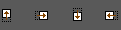 | Move the layout object upwards, to the right, downwards or to the left |
Appearance
Show print Margins. Zoom to Print Layout.
 | Show or hide print margins |
 | Zoom to full extent Print Layout |
Properties
Each component type has it's own properties. Change the presentation of the selected Layout component in the properties window.
Properties Text
 | Choose a font for the text. |
 | Enter the font size. |
 | Choose the color of the text. Use the color-picker window |
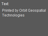 | Enter the text that is displayed in the Print Layout. Add a Runtime Object by placing it in curly brackets. This will generate an added text value, depending on the type of chosen Runtime Object. Scale {Scale} will display in the layout ex. Scale 1/100 Date {Date} will display in the layout ex. Date 18.10.2015 |
 | Lock Component: the component is unable to move. |
 | Fill Background: the background is filled with a white color, it improves the readability of the text. If the box is unchecked the background is transparent. |
 | Draw Border: The border of the textbox is displayed. |
Properties Line
 | Enter the line width. |
| | Choose the color of the line. Use the color-picker window. |
| | Lock Component: the component is unable to move. |
| | Fill Background: the background is filled with a white color, it improves the visibility of the line. If the box is unchecked the background is transparent. |
| | Draw Border: The border of the line component is displayed. |
Properties Image
 | -  Fit: the image is resized and rescaled to the box. Fit: the image is resized and rescaled to the box. -  Keep ratio: the image is resized to the box, the aspect is kept. Keep ratio: the image is resized to the box, the aspect is kept. -  No resize: the original size of the image is displayed. No resize: the original size of the image is displayed. |
 | Open the windows explorer and choose an image. |
| | Lock Component: the component is unable to move. |
| | Fill Background: the background is filled with a white color, it improves the visibility of the image. If the box is unchecked the background is transparent. |
| | Draw Border: The border of the image component is displayed. |
Properties Runtime Object
 | Choose the type. Each type will result in another text that is displayed in the Print Layout. The text is automatically generated. - Scale: the scale of the map in the Print Layout: ex 1/150000 - Date : the date when printed: ex. 14.02.2012 - Object Properties: - Information1: - Information2: - Information3: |
| | Choose a font for the text. |
| | Enter the font size. |
| | Choose the color of the text. Use the color-picker window |
| | Lock Component: the component is unable to move. |
| | Fill Background: the background is filled with a white color, it improves the readability of the text. If the box is unchecked the background is transparent. |
| | Draw Border: The border of the textbox is displayed. |
Properties North Arrow
| | - Fit: the image is resized and rescaled to the box. - Keep ratio: the image is resized to the box, the aspect is kept. - No resize: the original size of the image is displayed. |
| | Open the windows explorer and choose an image for the north arrow. |
| | Lock Component: the component is unable to move. |
| | Fill Background: the background is filled with a white color, it improves the visibility of the image. If the box is unchecked the background is transparent. |
| | Draw Border: The border of the image component is displayed. |
Properties Bar Scale
 | Choose a bar scale type: - Type 0 :  - Type 1 :  - Type 2 :  - Type 3 :  - Type 4 :  - Type 5 :  - Type 6 :  - Type 7 :  |
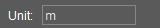 | Enter a unit that is displayed in the Print Layout that represents the unit of the scale in the bar scale. |
| | Lock Component: the component is unable to move. |
| | Fill Background: the background is filled with a white color, it improves the visibility of the image. If the box is unchecked the background is transparent. |
| | Draw Border: The border of the image component is displayed. |
Properties Legend Display
| | Lock Component: the component is unable to move. |
| | Fill Background: the background is filled with a white color, it improves the visibility of the legend image. If the box is unchecked the background is transparent. |
| | Draw Border: The border of the legend component is displayed. |
Properties Map Position
 | Adjust the position of the datasets: Zoom in or out or pan in the map component. Click STOP to end the function. |
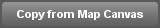 | After adjusting the position of the datasets, use this function to go back to the position of the map displayed in the Map View. |
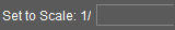 | Adjust the scale of the printed map to a specific scale. Enter the scale. |
| | Lock Component: the component is unable to move. |
| | Fill Background: the background is filled with a white color. If the box is unchecked the background is transparent. |
| | Draw Border: The border of the map component is displayed. |